
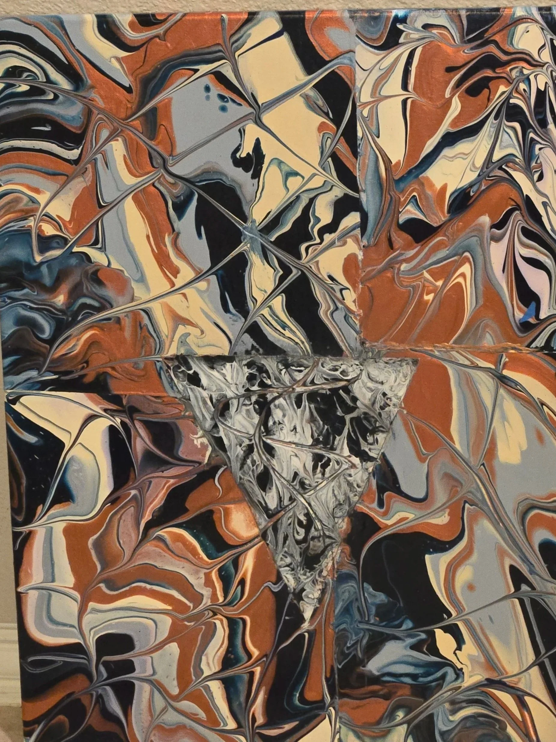
Acrylic fluid art -bold and distinct
Bold and distinct fluid artwork designed for an office setting — a composed, professional piece that balances energy and calm.
Concept
Composition: Broad, sweeping fluid flows with a clear focal band across the canvas to draw the eye without overwhelming the workspace. Use layered pours and controlled swirls to create depth and motion while maintaining a refined silhouette.
Mood: Grounded yet confident. The piece should convey stability and creative momentum — appropriate for reception areas, conference rooms, executive offices, or collaborative spaces.
Color palette
Earth tones: Warm umber, raw sienna, soft ochres, and muted taupe to provide grounding and warmth.
Deep blue: Navy and indigo accents to add calm authority and contrast.
Burgundy: Rich wine and oxblood highlights to inject sophistication and subtle energy.
Neutrals: Soft whites and charcoal veining to define edges and create visual breathing room.
Placement and lighting
Hang at eye level with the center approximately 57" from the floor.
Use soft, diffused lighting or adjustable gallery lighting to reveal texture without hotspots.
Avoid direct harsh sunlight to preserve colors and prevent accelerated wear.
Create a fluid artwork that confidently anchors the room: earthy warmth for approachability, deep blue for calm leadership, and burgundy for refined energy. The result should be visually striking yet composed — an artful expression of focus and tranquility suitable for any professional environment.